With the wild ride of the Iowa caucuses behind us, it’s clear that few accurately predicted the outcome on the Republican side. Most of the major pollsters missed calling the Cruz’s victory: FiveThirtyEight didn’t see it, nor RealClearPolitics nor even the vaunted Des Moines Register. And though Clinton was an easy pick, polls suggested a much stronger victory.
How could the predictions have been so wrong after ostensibly reflecting public opinion for months? Blame the fuzziness of drawing predictions from questionable polling data.
Here’s the biggest pitfall of statistical modeling: even if the math is correct, a flawed line of thinking can make the entire model useless. I set out to demonstrate the perils of predicting the future by constructing my own model.
To do this, I started by dividing the polls by time – that is, when a sample was taken — and calculated averages for any overlap. I then used how much the numbers moved from one time range to the next as a measure of volatility. From these values, I selected a representative range and calculated its standard deviation. That number represents how far percentages should move from one time frame to the next across the board, so I applied it to the most recent poll numbers at the time, and came up with my projection.
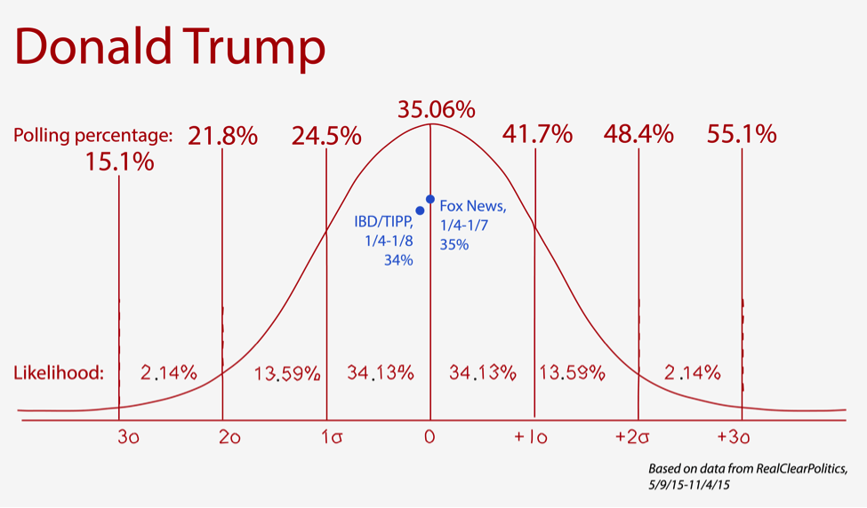
Here are my results from analyzing Donald Trump’s numbers:

(You can peruse the charts for other Republican hopefuls here)
The dots show polls conducted after the model was drawn, and the curve projects how likely different results are, according to my math. Pretty close! I didn’t have complete faith in my work though, so I consulted some experts.
First, I want to emphasize that I used sound statistical methods. They’re based on a concept in stock market analysis called historical volatility, which calculates in a sample of prices how far a stock’s value has moved from day to day. If you have that data, you can create a normal curve from the current price predicting how far it will (probably) move.
I applied that math to polling data, treating primary candidates’ numbers like stocks. They certainly act the same; Ben Carson has been through more swings than the Dow in 2008. But while the logic makes sense at first glance, this is where things get dicey.
I didn’t account for one key difference between stocks and polling percentages. Andrew Gelman, professor of statistics and political science at Columbia University, told me polls represent what people think, while stocks factor in market information to reflect their own inherent value. Stocks are equity, a tradable good with determinable worth, whereas polls are opinions that change with a multitude of outside factors.
“It’s not that the polls are telling you that the polls are going to change,” Gelman said.
In addition, polling data is apparently terrible for statistical modeling. It’s fraught with challenges, including unverifiable answers, non-representative populations and changing attitudes, according to Gelman.
David Brillinger, professor of statistics at UC Berkeley, told me statisticians prefer to use sample surveys for serious modeling.
“Polls are dreadful,” he said. “They’re just biased.”
So, it turns out I was pretty far off base – my math was OK, but my concept was off.
“But Nick,” you might wonder, “if your concept was so wrong, how were your predictions so right?”
And for that, you can thank the smoke and mirrors of statistics.
My predictions weren’t as correct as they appear. Predictive normal curves only broadly represent where a value could move; they’re rough sketches that don’t indicate an exact number, or even a direction of change – up or down, that is. And for polling data, which isn’t very volatile, one standard deviation captures nearly all short-term movement.
Even in finance, where statistical models are widely used in prediction, errors occur with sometimes devastating results. Analysts and investors build many predictions on the assumption that returns will fall within three standard deviations, meaning they distribute more risk outside of the likely range. This, as a 2012 public comment letter from Robert Johnson of the Roosevelt Institute and Joseph Stiglitz of Columbia University points out, amplifies the consequences of crashes when they do happen.
We can forecast some things with confidence, though. At a certain point, presidential election results become easily predictable, something Brillinger proved while creating county-by-county projections for NBC in the 1960’s. The network asked Brillinger and his colleagues to build a model to ensure accuracy in 95 percent of the statements their correspondents would make on air about the returns.
“We were right on the mark,” he said. “It’s just sort of amazing how well people can predict the results before you get the vote in.”
And that speaks to the problem with predicting the future. Sometimes we’re sure of what’s going to happen, as when looking at voting returns. Sometimes our guess is flawed, but it still looks correct. And in all cases, there’s a chance we could be catastrophically wrong.
Even though I won’t take Nate Silver of FiveThirtyEight’s job anytime soon, Iowa has made it clear that even the best can get it wrong. We count on experts to handle data honestly, but it can be hard to tell what’s real and what’s cleverly disguised behind bad math. As University of Pennsylvania Professor Philip Tetlock once said on Freakonomics Radio, a lot of experts are no better at making predictions than “a monkey with a dartboard.”
So keep your eyes open as election season continues. I’ll see you in New Hampshire.